

I would like to congratulate everyone who entered our "Create a really cool CCF, win a Philips ProntoPro" contest, which ran until November 15th, 2001. Although there can only be three remote control prize winners, everyone who entered receives an exclusive Philips Pronto T-Shirt for their fantastic efforts!
First, a little bit about the contest. What we were looking for were new, imaginative custom configuration file (CCF) layouts for the Philips ProntoPro TSU6000 remote control. All designs were judged by Remote Central and an independent panel of 5 Pronto enthusiasts, on the following criteria:
Originality 35%: how unique the design and graphics are.
Layout 25%: button placement and ergonomics.
Quality 20%: overall "fit and finish" of the file.
Overall 20%: how well the entire file works.
Judges: Andrea Whitlock, Andrew Von Deesten, Eric Johnson, Greg Mitchell, Peter Dewildt.
If you would like to view the full original contest guidelines, click here.
Our first place prize winner receives a brand new Philips ProntoPro TSU6000 valued at $999 USD, while second and third place winners will each receive a Philips Pronto TSU2000 valued at $399, all provided courtesy of Philips! So, without further ado, on to the winners!
| GRAND PRIZE WINNER |

| Data Box |
| Originality: | 8.5 |
| Layout: | 8.2 |
| Quality: | 8.1 |
| Overall: | 8.7 |
| SCORE: | 83.8 |
|
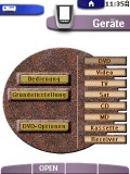
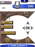
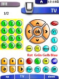
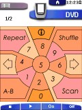
John Corkery's file proved to be the unanimous winner amongst all judges, with a clean look and refined layout. Greg Mitchell felt that "the 3D look and especially the consistency from page to page" was carried out extremely well, allowing "any user [to] pick up the remote and use this setup". Andrea Whitlock praised the entry, saying that it "really jumped out from all the other[s]", with a design that made this "one slick, polished CCF!" Eric Johnson was equally impressed, describing it as a "no nonsense 'make it easy to operate the gear' configuration". With a final score of 83.8, John Corkery is the grand prize winner of a Philips ProntoPro! As one judge put it, "almost perfect!"
[ AUTHOR: John Corkery | DOWNLOAD ]
|
| | | | | |
|
| | SECOND PLACE | THIRD PLACE |
| Data Box |
| Originality: | 8.5 |
| Layout: | 5.6 |
| Quality: | 7.3 |
| Overall: | 5.7 |
| SCORE: | 69.8 |
|
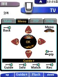
Second place in our contest - and winner of a Philips Pronto TSU2000 - goes to Niels Voigt for his unique color design. Greg liked the file, but thought that "the extremely small buttons and lack of color differentiation between the button text and background art make this look far too busy". Eric Johnson thought that this was "a spectacular design with terrific original art everywhere", but that "ergonomics suffer via small buttons and unusual, even surprising button placement".
[ AUTHOR: Niels Voigt ]
[ DOWNLOAD ]
|
| Data Box |
| Originality: | 6.8 |
| Layout: | 7.4 |
| Quality: | 6.6 |
| Overall: | 6.9 |
| SCORE: | 69.3 |
|
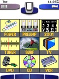
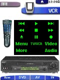
David Armour's layout pulled into third place in a near dead-heat with second. Greg Mitchell appreciated the "clean, usable layout of this configuration" and thought that the graphics were quite good, though would have scored higher with a more "3D look". Eric Johnson thought that it had "a nice home panel with some great original art" along with "a lot of extra programming for the power user" (such as a surf screen, calendar and direct access to preamp functions).
[ AUTHOR: David Armour ]
[ DOWNLOAD ]
|
| | | | | |
| RUNNER UP #4 | RUNNER UP #5 | RUNNER UP #6 |
| Data Box |
| Originality: | 7.4 |
| Layout: | 6.2 |
| Quality: | 6.7 |
| Overall: | 6.8 |
| SCORE: | 68.4 |
|
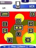
Just slipping into fourth place is this entry by Dan Haddix, whose layout featured a totally custom interface with custom graphics. Greg Mitchell commented that it was "simplistic, but usable" - something that's not actually bad in a remote control.
[ AUTHOR: Dan Haddix ]
[ DOWNLOAD ]
|
| Data Box |
| Originality: | 5.8 |
| Layout: | 6.4 |
| Quality: | 7.3 |
| Overall: | 7.7 |
| SCORE: | 66.3 |
|
Fifth place is held by this layout created by Bill Bates. Andrea Whitlock thought that "although the graphics aren't as dazzling as some of the other entries", "the layout and navigation is where [this CCF] really shines; it stood out from the other entries in the category".
[ AUTHOR: Bill Bates ]
[ DOWNLOAD ]
|
| Data Box |
| Originality: | 5.2 |
| Layout: | 5.6 |
| Quality: | 6.9 |
| Overall: | 6.8 |
| SCORE: | 59.6 |
|
In sixth place comes this entry from Bill Flite, which features original and clear - if not overly creative - graphics. Logical layouts and a consistent theme make this an ideal CCF for almost any equipment list.
[ AUTHOR: Bill Flite ]
[ DOWNLOAD ]
|
|
| OTHER QUALIFYING ENTRANTS |
I tried to design a CCF that was fun, interesting and easy to use. It has some cool effects and I have tried to keep the pages uncongested.
By Anthony Philippoussis
[ DOWNLOAD ]
|
This CCF is a task and component hybrid, incorporating an extremely intuitive interface that also acts as a productivity and information tool and is family-friendly.
By Bob Hicks
[ DOWNLOAD ]
|
I designed the remote's interface to make the system as user friendly as possible. I tried to keep the overiding layout of all main panels similar in layout and function.
By Brett Vrancken
[ DOWNLOAD ]
|
|
I used theme photo backgrounds and have also incorporated my entire DVD collection sorted by alphabet. I've tried to keep it as functional as possible.
By Claudio Santulli
[ DOWNLOAD ]
|
This color CCF is designed for ease of use by logically integrating multi function, multi panel buttons on the device panel where you would need them.
By Guy Damiani
[ DOWNLOAD ]
|
My CCF contens a completely original colorized metalic design that's converted from my B&W Pronto. I can control my entire home theater system with ease.
By Hagen Schütte
[ DOWNLOAD ]
|
|
Why create pictures of buttons when you have color graphics? The only 'buttons' in this CCF are the hard buttons... the rest are either graphics or text.
By Jared Meiners
[ DOWNLOAD ]
|
Graphics and color scheme are inspired by the musical rock group BOSTON, along with animated transitions, help panels, password protection and many macros!
By Mike Kistler
[ DOWNLOAD ]
|
The pages of each device are set up for appearance and function, but mostly to look less like a machine or advertizement for product and more like a piece of art.
By Robert Johnson
[ DOWNLOAD ]
|
|
| |
I think that colors must be significant to be efficient, meaning that a device should be designed with a specific color. I also do not like 'buttons', so I used 'zones'.
By Roland Lannuzel
[ DOWNLOAD ]
|
Five submissions did not meet the minimum requirements. |
|
|