Your Universal Remote Control Center
RemoteCentral.com
The Great ProntoPro NG PCF Design Contest
Up level

Up level
The following page was printed from RemoteCentral.com:

The Great Philips ProntoPro NG PCF Design Contest
You are on contest entries page 4 of 6.
[ Home ] [ Page: |1|2|3|4|5|6 ] [ View Results ]
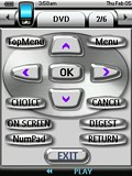
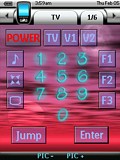
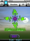
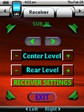
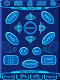
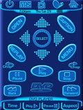
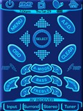
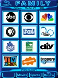
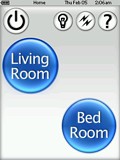
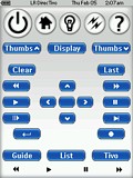
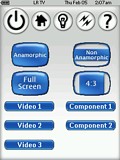
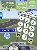
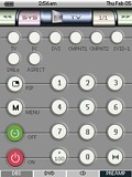
#16: Mostly Chrome

I like chrome so most of the layouts are that. For the CD I used a copper layout. For the Tuner and DV Cam I used transparency. From the Home page, short transaction animations are used.

On the Devices page you will find more stuff including the VCR and the DV Cam. I like my 5.1 speaker balance page which you can get to from most devices by pressing the 4-speaker button. You just select the speaker you want to adjust and use the left or right arrow keys. If you click the "RECEIVER SETTINGS" button you'll get to a page where I was experimenting with nature buttons. Looks like it could use some cloud buttons!

[ View & Download ]

#15: One For All

If you're looking for animations and wild colors, then this PCF is not for you. It was designed with the older generation in mind, with nice big buttons, large text and a simple but effective layout. All buttons have a pressed and released state image. As on all of my PCFs, I have included the cursor buttons on the screen as well as the hard buttons. XaraX was used entirely for the design.

[ View & Download ]

#14: White Plastic

This layout is an evolution of my TSU3000 layout. It is activity-based and makes heavy use of macros to control my two zones of equipment and home automation. The layout of hard and soft buttons for each device follows a pattern, making it fairly simple to learn to use. It contains a fairly extensive help system. The look borrows from the plastic look of some of the Max OS X widgets.

[ View & Download ]

#13: The Infrared Interstate

RUNNER UP! This is a completely custom PCF, with an emphasis on navigation and simplicity. The top area of the design remains consistent from one screen to the next, making operation of the remote fairly intuitive. An "All Devices" button on every screen gives the user access to a given device within two button presses. I've avoided duplicate buttons (like having 4-way toggles on screen) that might confuse novice users. All graphics (with the exception of the Favorites show icons) are 100% original.

[ View & Download ]

#12: Gizmo-Man

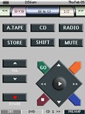
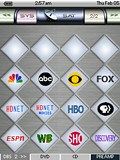
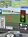
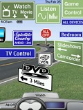
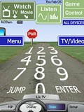
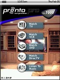
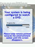
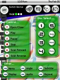
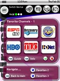
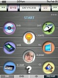
This is my attempt to design a unique configuration for the ProntoPro NG. I like to design devices that look similar to the original remote, so others could operate the remote with ease.

The TOOL, DEVIVE and PAGE# labels have changed cosmetically. HARD-BUTTON 1 through 4 are reserved for instant access to frequently used devices. HOME and HARD-BUTTON 1-4 also function as page down when pressed again.

For additional info, press the [?] button, where available.

Note: Some buttons (lights and scene) are not programmed since there are many different ways to send X-10 signals. Also, toggle li... (read more)

[ View & Download ]

#11: OS 2k4.0 Pro

This design is straight forward and flexible and takes advantage of the advanced graphics capability of the TSU7000. The interface was designed to be user friendly for all who may use it. In most cases, each component has one screen containing the most used buttons that keeps ‘screen flipping’ to a minimum. Furthermore, the user can switch from any component to another from any screen in the interface. For example, if you are watching TV and want to switch to the DVD, all you need to do is tap the DVD icon on the top of the page and the TSU7000 will turn off the TV and switch on all components... (read more)

[ View & Download ]

Continue to more entries on page 5! 

Hosting Services by ipHouse