Your Universal Remote Control Center
RemoteCentral.com
The Great ProntoPro NG PCF Design Contest
Up level

Up level
The following page was printed from RemoteCentral.com:

The Great Philips ProntoPro NG PCF Design Contest
You are on contest entries page 5 of 6.
[ Home ] [ Page: |1|2|3|4|5|6 ] [ View Results ]
#10: Trek7000

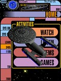
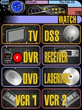
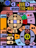
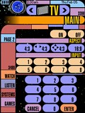
This PCF design is based on LCARS (Library Computer Access and Retrieval System), the graphical computer interface seen on certain Star Trek TV series. There are control pages for a TV, DSS receiver, TiVo, ReplayTV, Receiver, DVD player, LaserDisc player, 2 VCRs, CD player, tuner, tape deck, video games, lights, and curtains.

A few of the standard system items have been replaced to take advantage of the whole LCD and create a complete design:

  • The activity icon is now a Star Trek phaser and pops up while the Pronto transmits.
  • The battery gauge is a functioning LCARS-style battery ga... (read more)

    [ View & Download ]
  • #9: Pick a Theme

    Ever get tired of the same old graphics on your Pronto? My design is theme based: each user can have their own theme! Or, a user can change themes every week or month. The button colors and backgrounds change, but the button placement is the same for all themes. My design has elegant buttons, a simple navigation system, and can be easily customized for any user.

    [ View & Download ]

    #8: Redrock

    This layout is an evolution of my TSU3000 layout. It is activity-based and makes heavy use of macros to control my two zones of equipment and home automation. The layout of hard and soft buttons for each device follows a pattern, making it fairly simple to learn to use. There is a help screen for each device. The skin is based on a pattern that matches the paint of our living room.

    [ View & Download ]

    #7: The Works

    The result of my design: 134 custom-made buttons (not counting spacers & labels)! My favorite button is the volume toggle in the lower right page. Here's what's unique about my configuration:

  • Consistent frame-based GUI with three button groups in frame:
    TOP: device selection with trinary button states - pressing a pressed button in the main page of a device executes a setup macro with auto-power-on, etc.
    LEFT: device specific buttons, e.g. TiVo: Favorites, Thumbs Up/Down, Slo-Mo
    BOTTOM: “orthogonal” (e.g. X-10 & Amplifier are always needed independent media devices), or common ... (read more)

    [ View & Download ]
  • #6: Giraffe

    This layout is an evolution of my TSU3000 layout. It is activity-based and makes heavy use of macros to control my two zones of equipment and home automation. The layout of hard and soft buttons for each device follows a pattern, making it fairly simple to learn to use. It also contains a fairly extensive help system. This look is the result of my wife asking me to do a layout that matched her favorite purse!

    [ View & Download ]

    #5: Digital Lifestyles

    This remote features for the user:

  • Inviting splash screen introduces the location of the remote, the designer, and features inviting background art.
  • Color-coded functionality, allowing easy discernment between video and audio functions. The user may simply glance at the remote to find where they are.
  • Directions are provided on pages that may need instructions to continue use.
  • Subdued background art demonstrates the selected function without overpowering displayed buttons.
  • Latching source buttons that glow to let the user know exactly where they are.
  • Pages are titled... (read more)

    [ View & Download ]
  • Continue to more entries on page 6! 

    Hosting Services by ipHouse