|
...Continued from Page 8.
Over time it’s possible for the LCD’s calibration to get out of whack, where you press one point and it thinks you’re pressing another. Not to fear, the Director includes a handy re-calibration screen for correction. In addition, the "System" setup menu include beep confirmation tone on/off settings, a system modification lock, the ability to completely reset the remote, plus an "About" screen that gives an indication of how much free memory is remaining. The remote even features a low-battery warning and memory protection, so your setup is not lost when the remote has no power. The manual mentions that a recharging docking station for the Director will be a future option.
What, no main menu?
One interesting change has been One For All’s decision to emulate the operation of a hard-buttoned remote as much as possible. To that end, there is no concept of a separate "Main Menu" on the Director – devices are selected solely from the ever-present device bar. If you choose to add system macros below that, it’s almost like having a permanent on-screen main menu. Which brings up the subject of how the Director uses it’s screen. First, if you choose not to have system-wide macros, a region below the screen – 9% – will always remain blank. Compounding that, above the device bar is yet another section of screen that’s only used when programming the remote. During normal operation it’s completely blank and looks, well, a little odd. This section is a bit bigger and occupies approximately 14% of available screen space.
Congestive white space.
Despite the screen being so large, it manages to feel cramped by the surrounding plastic bezel. Buttons are positioned up to the very last possible pixel, making the bottom left and right device buttons hard to press comfortably. Then, due to the stylish inward curve of the plastic surrounding the hard buttons, the device bar’s "right" arrow is situated right against the plastic. Furthermore, two of the most commonly used buttons – "next device page" and "previous device page" – are stuck in a minuscule amount of space at the very top right-hand corner of the screen. Why have all that empty space above the device bar if you’re going to awkwardly jam everything else together? If you’ve got large fingers those buttons can be very difficult to use.
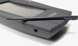
Which is probably why the Director comes with a stylus – having a fine point allows you to pick out even the tiniest on-screen button. Except that the stylus has such a sharp, pointy tip, I’d worry about cracking the screen if anyone pressed too hard with it. If you pick one of these up I suggest rounding off the stylus with a bit of sandpaper or an emery board. Since the screen only has two colors, contrast is pretty good – but an annoying side-effect is visible flickering. This is the first remote I’ve seen where it’s easy to see the screen refresh with the naked eye. It’s even more pronounced when seen in peripheral vision.
|