|
...Continued from Page 1.
2. Use anti-aliasing to smooth things out.
 Simply put, "anti-aliasing" is a method of smoothing out the edges of images, eliminating what are commonly referred to as "jaggies". This is a technique similar to Windows' built-in "font smoothing", which makes screen fonts easier to read. For example, instead of creating a black object solely out of black, the edges of the object are filled in with different shades of gray (see inset upper right). So, rather than a small circle appearing as a jagged stack of Lego bricks, it appears as a smooth, even curve.
This professional technique can be used for a lot more than just sharply contrasting objects. For instance, look at the two examples above. The one on the left was created without anti-aliasing, while the one on the right was. You'll notice that the right-side graphic appears to have greater detail and is more pleasant to look at. Thus, when importing or creating graphics for your remote, always ensure that the "anti-aliasing" or "smoothing' option is enabled. This will give your remote's user interface a truly refined look.
If such an option is not available, you may be able to emulate this function by resizing a larger image smaller - see the next tip for more details.
3. Think big - finish small.
Although this may seem like a strange idea, it's always better to start off with an image larger than you need. To explain further, if you start off with an image at least four times bigger than the finished piece will be, the end result will be that much better.
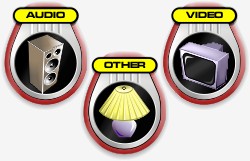
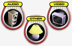
Over the years, I've found that creating graphics 1:1 (actual size), while resulting in decent quality images, just isn't quite as good as starting off larger and then resizing smaller afterwards. All of the images in my ProntoPro layout were imported from vector artwork four or eight times as large as I wanted them, then shrunk down to the proper dimensions. This allows the software's resizing algorithms - which are generally better than the import or creation ones - to refine larger amounts of detail and come up with the best looking image.
Compare the two examples below closely. The one on the left was originally imported at 250 pixels wide with anti-aliasing enabled, while the one on the right was created at 1000 pixels wide, then resampled down to 250 pixels with anti-aliasing. Look closely at the television, the text and the vertical lines immediately below the text.
Even if you're not starting off with a vector-based file and are instead working solely in a bitmap editing program, you can still obtain better results, especially from special effect filters, if you work on a larger file.
|