|
 |
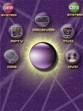 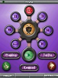
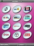 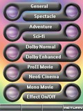
For: Philips ProntoPro NG By: Scott Harris | Contest Entry #18: Syd7 This PCF has all original graphics that make use of the transparency and colors available. Each device has a uniquely colored background for all of its related pages as well as a help screen to identify the functions of the cursor and its surrounding buttons. The layout is quite intuitive to use. The soft buttons are well sized and spaced to help avoid pressing the incorrect one. |
|
 |
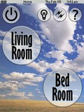 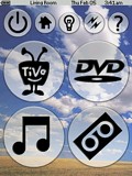
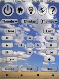 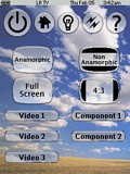
For: Philips ProntoPro NG By: Adam Bursey | Contest Entry #19: Big Sky This layout is an evolution of my TSU3000 layout. It is activity-based and makes heavy use of macros to control my two zones of equipment and home automation. The layout of hard and soft buttons for each device follows a pattern, making it fairly simple to learn to use. It also contains a fairly extensive help system. This look is the result of me playing around with transparent buttons. |
|
 |
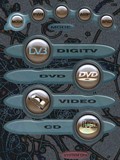 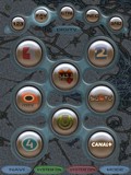
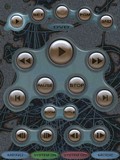 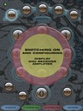
For: Philips ProntoPro NG By: Ari Sinisalo | Contest Entry #20: Blasenkammer This ProntoPro NG layout is named 'blasenkammer' after an inspiring picture of bubble chamber experiments I found some times ago in the net. (Blasenkammer = bubble chamber auf deutch.) Parts of that picture, heavily edited, are used as background in this layout.The usability model of my layout is action or mode based and it originates from my ProntoNEO layout that I have found practical among users of different ages (5 - 77). Use of the hard keys at the bottom of the screen (Firm1-Firm4) differs from almost all of the layouts that I have seen. The middle ones are used in all modes to power up, configure and switch down the whole system. I call these buttons green and red buttons (in fact I painted the hard buttons on my ProntoNEO green and red accordingly). Leftmost hard button is used to accees menu functions for main device in current mode. Righmost is used to go back to home page and to re-select the mode. To start up the system select first from the home (mode) page what you want to do: watch TV (actually DVB or Digi TV), watch DVD, watch VCR or listen to CD. The selected button takes you to mode pages. Note that the system is not automatically turned on. In order to do... (more) |
|
 |
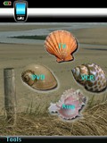 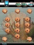
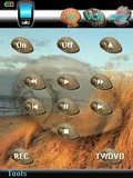 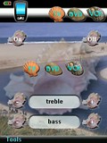
For: Philips ProntoPro NG By: Rona Wittner | Contest Entry #21: Seashells With this file I wanted to demonstrate the usage of animations. The theme that is chosen is based on the seashore. Four types of shells are used to represent the four devices TV, VCR, DVD and Amp. They are presented right away on the home page.All devices have their own sea shore background. The buttons on each device are small versions of the shells to get a uniform look and feel. The top bar shows the other devices for quick selection.The animations are implemented as macros (in hidden devices) with a series of page jumps. The following animations are included:
- When a shell is selected on the home page this one becomes enlarged on the background. The others move to their place in the top bar.
- In a device page press the Home hardkey and the same animation is played backwards.
- In a device page select another device from the top bar and this one becomes the center. This is not a separate animation. Instead it just executes the Home macro and then the device selection macro from the home page.
- There is a fifth animation, but that one you have to find for yourself!Background bitmaps are created from photographic material found on the internet and... (more) |
|
 |
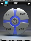 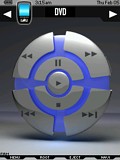
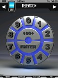 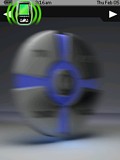
For: Philips ProntoPro NG By: Tom Molstad | Contest Entry #22: Chloe SECOND PLACE WINNER! Chloe is a device oriented PCF for TV, DVD, VCR, AMP and LIGHTING. The file has a unique colorful 3D interface with transitional animations. Each device has a single page and makes use of the “firm” buttons, which are labelled on the LCD screen. Included is a template page for other devices or to flesh out included devices. All buttons have “delay” placeholders. Try it in the simulator to see the animations! |
|
 |
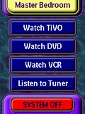 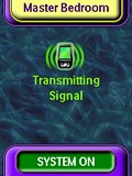
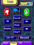 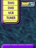
For: Philips ProntoPro NG By: Mitch Mrvos | Contest Entry #23: Sliding Tabs My system design is based in a completely custom operating environment with all custom graphics and animation. It was designed for ease of use and to have a high WAF rating. (That’s Wife Appreciation Factor!) It can operate on either device or action based depending on the user’s preference.Device based operation is accessible by simply touching the device banner at the top of the screen and selecting the desired device from the list. Action based operation, including system power, is accessed by pressing the home button. The lower left hard action buttons are direct access to a surround mode and a multi zone page. All page navigation within each device can be accessed with either the side toggle or the 4 screen hard buttons, which have selection feedback to identify each page. All page transitions use a simple morphing animation. I believe that the design’s best feature is that my wife actually uses it to control my bedroom system without my help and with very little explanation of how it works. |
|
 |
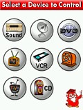 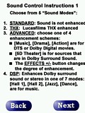
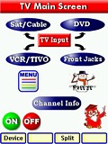 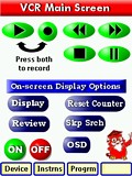
For: Philips ProntoPro NG By: Michael Burwen | Contest Entry #24: Simple Elegance This design was created with specific ergonomic objectives in mind:- Ease-of-vision, particularly by senior citizens. This dictated using relatively large, primary-color icons against a white background. The color scheme was devised by Mr. Gary Hoover, a retired famous movie-industry colorist and graphic artist.
- To provide self-contained instructions. On each page, depressing the owl "professor" icon leads to one or more text instruction pages.
- No more than two screens to operate any single device.
- To use the hard buttons as much as possible.
- K.I.S.S. i.e., pass the "wife" test.
Most of the graphics are original and were created with Paint Shop Pro 8. The instruction screens were created with Photoshop Elements 2.0. |
|
 |
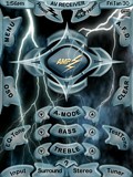 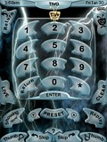
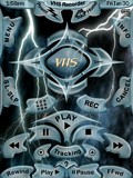 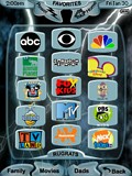
For: Philips ProntoPro NG By: David Shaw | Contest Entry #25: Black Lightning I decided to do something a little different on this PCF! You will find very few buttons that are ovals, circles or rectangles. Each type of button has its own unique shape and shading. Most of the text is on a curve to match its button. Almost every button is semi transparent to some degree using the PNG alpha-transparency. Most buttons have a pressed and released state. The pressed and released buttons are interchangeable, so you could change the color scheme of the PCF by changing these two buttons around.There are sequences of lightning strikes that can be "animated" into your macros, so it looks like a lightning storm when the macro runs. The cursor buttons are both on the screen and the hard buttons. |
|
 |
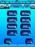 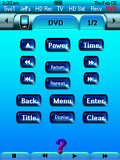
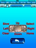 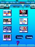
For: Philips ProntoPro NG By: Jeff Cooper | Contest Entry #26: Tranquil Blue This is my first Pronto configuration. My goal was to replace my MX-1000 with the TSU7000, and add a few things that I could not do on the MX-1000. I set out to create a 100% original art work configuration. I created the buttons using Crystal Buttons, followed up with enhancements using PhotoImpact. I also tinted the system bitmaps blue by replacing the bitmaps in the PCF file, and created pressed bitmaps of all buttons to look like they are lighting up when they are pressed.I created a device bar for my major devices. This can be clicked to jump directly to a device although you have to use your fingernail since it so small. I also created an information screen for the device hard buttons. |
|
 |
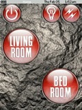 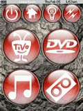
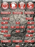 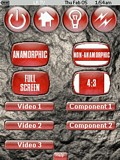
For: Philips ProntoPro NG By: Adam Bursey | Contest Entry #27: Stoned Aqua This layout is an evolution of my TSU3000 layout. It is activity-based and makes heavy use of macros to control my two zones of equipment and home automation. The layout of hard and soft buttons for each device follows a pattern, making it fairly simple to learn to use. There is a help screen for each device. The skin resulted from a hybrid of Aqua-like plastic button and a rough stone background. |
|
 |
More Original Design Systems: [ < Back | Next > ]
Return to the Complete System Setup Files index. |

