With 240X320 you cant really get revolutionary with navigation. I think everyone uses a home page just like you have it. I use my home page to enter into sub sections also so to get to blu-ray its Home/Video/Bluray. To get to security cameras its Home/Security/CCTV.
I cant remember but whats that MORE logo graphic for? Does it slide out or is it just the note telling you to use the side trigger. I would lose that. The side trigger (when it works) is super intuitive so no point in wasting the space for the note.
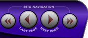
This is the gallery for my 240X320 template. You can see examples of button layout for typical sources.
[Link: guijaboard.com]I made this iPhone style template a while ago. Its not a direct copy of the iPhone on purpose but it mimics it. Maybe just a brighter template is what the client is after?
iPhone TPMC-3X
[Link: guijaboard.com]iPhone icons
[Link: guijaboard.com]Finally.. i just did the iPad iPod and im really digging the new navigation bars for the ipod. I might update the other smaller screens to this. Scroll thru the ipad screenshots and towards the back you will see the ipod screenshots.
[Link: guijaboard.com]